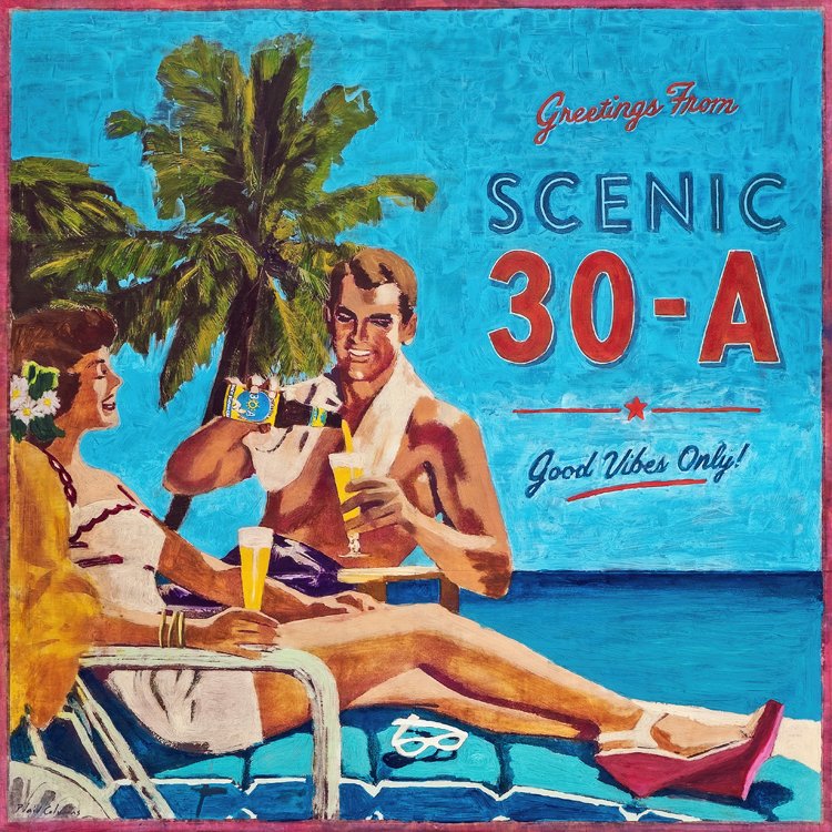
Often the best thing for a painting is to struggle with it. With this one it was simply getting the contrast just right between the vibrant sky and the red text so that both popped. There was a lot of back and forth. Lighten and brighten the sky without losing it’s vibrancy. Darken the text without losing its tone and harmony with the rest of the painting. This was tricky only because there were marks and details I did not want to lose in the reworking.
I don’t think I ever truly get stuck on a painting, some just go faster than others. But wrong turns can lead to interesting places, and sticking with it is almost always worth the extra time.
I made this painting in honor of Memorial Day, which is why I the chose the red, white and blue colors in the text. I’d like to think the couple are toasting to those who gave all. Check that, I know that’s what they are toasting too.
Cheers!